
by Helzkat Designs (aka Eleni Konstantine)
In the post, You can't judge a book by its cover, right? Umm, Wrong, I discussed familiarising oneself with what the market - aka your genre - is doing with covers. While you don’t want to mimic it exactly, it gives you a good idea of reader expectation.
The second post, Magic Thursday: The Nuts & Bolts of Designing a Book Cover! (Part 1: Finding Images), I discussed royalty-free stock images and how to search for images for a short story collection.
The third post, Magic Thursday: The Nuts & Bolts of Designing a Book Cover! (Part 2: Analysing Comprehensive Scene images looked at selecting and analysing images in the Folders that were comprehensive scenes.
Today, we're going to analyse images that are not comprehensive but have an aspect I like that can be used in the cover - this can be either for the background or other elements.
Looking at the Favourites Folder
This is my fourth blog post on the topic of cover design.
In the post, You can't judge a book by its cover, right? Umm, Wrong, I discussed familiarising oneself with what the market - aka your genre - is doing with covers. While you don’t want to mimic it exactly, it gives you a good idea of reader expectation.
The second post, Magic Thursday: The Nuts & Bolts of Designing a Book Cover! (Part 1: Finding Images), I discussed royalty-free stock images and how to search for images for a short story collection.
The third post, Magic Thursday: The Nuts & Bolts of Designing a Book Cover! (Part 2: Analysing Comprehensive Scene images looked at selecting and analysing images in the Folders that were comprehensive scenes.
Today, we're going to analyse images that are not comprehensive but have an aspect I like that can be used in the cover - this can be either for the background or other elements.
Looking at the Favourites Folder
I go back the images saved in the folder named 'Short Story Collection - Enchanted Dreams' (the collection is spread over three pages). This time, I'm looking at images that either be used as a background image, or have an element(s) or concepts that is appropriate for this cover. Basically this approach looks at combining multiple images.
Background images


Again similar scenes and colouring, which is soft and appealing. I think they both need something more. A dragon? A person on the moon (would be small though but would depend on how it was cropped), a person swinging from the moon would be more like it. :)


The window image is lovely and contained. It's a little bit wide for a book cover but it can be possibly manipulated. A moon can be added and a couple of other elements to make the scene dreamlike and enchanting.


Again these could be comprehensive scenes for another type of book cover. I think they need something else. They can be cropped at just the right spot to achieve the look I'm more after. I can see a ladder for image 1, a silhouette of a dragon for image 2, and a hot air balloon for image 3. But I do find that sometimes you don't know what works until you mock (quickly) the images. These are mostly dark images so brightness and contrast may need to be adjusted. Concepts I'm liking are are balloons, moons, clouds, night sky, sea, windy road.


I love the swing concept (as you saw in the last post), as well as clouds and stars. Long, flowing material may look good here. While I do like this image, I think the ones from last post were probably better suited for this short story collection.


Doesn't these two images scream 'magic'? You can either add/merge these on top of a background image (just as long it's not a crowded one), or you can make it so it becomes the background image itself. So much choice!
Round up
Being able to use images for backgrounds or elements is an option if you can't find a comprehensive scene you like. By combining more than one image, you create something totally unique that no-one else has.
Next time... Mock ups including using commercial fonts
~HelzKat~
~~~~

HelzKat Designs (Helen Katsinis) specialises in designing for writers at affordable prices.
She delivers the right look for each project from book covers, banners, business cards, to setting up and customising blogs and websites. She has also given talks to authors on the subject of blogging and navigating in the online world.
She began by designing author banners for her writing persona (Eleni Konstantine) and her writing groups. After winning the 2010 Little Gems Cover Contest (Topaz), she started to specialise in designing for other writers thus combining her two worlds of design and writing.
In 2018, she's entered the world of pre-made covers. You can see available covers HERE.
Get 50% off any pre-made cover until 30th April 2019 by using the code: DSDUblog.
Let's look at some of the images, keeping in mind the theme is enchanted and fantastical. It's harder to say yay or nay to some of these as they may need to be placed in a mock up first before a decision can be made.
Background images
The below would mostly be cropped in a book cover due to horizontal orientation (though you can turn turn image on side and get something different and portrait in orientation). These are suited for background images.


There is nothing more spectacular than how the universe looks. The top two images are similar. They are colourful but at the same time have a black contrast. Adding an appropriate image(s) on top could work. They may need to be adjusted so the text doesn't get lost. The bottom one is darker and so light text and other images would stand out more.

Again similar scenes and colouring, which is soft and appealing. I think they both need something more. A dragon? A person on the moon (would be small though but would depend on how it was cropped), a person swinging from the moon would be more like it. :)


I just love fluffy clouds. They are perfect for a background. The pink clouds have a surreal feel to them while the moon/cloud image could be manipulated to be more surreal if you wished, but can still be used as an effective background as it now looks. The stairs and clouds are a little bright, so colour/brightness could be manipulated. Also I'm not sure of the stone steps but love the idea of steps/stairs/ladders going into the sky.


A background image with flooring is a different look that might just work. A figure or another image can easily be added and flow with these images.

The window image is lovely and contained. It's a little bit wide for a book cover but it can be possibly manipulated. A moon can be added and a couple of other elements to make the scene dreamlike and enchanting.

Now doesn't this look amazing. The colours are vibrant yet not overpowering, and I love how her hair looks to be part of the background. I think a tattoo on her back would suit. Though could this be too much bare shoulder? It could be cropped differently to suit.


More scenic images. Yes, these could be considered comprehensive but I think they need something else to denote the stories. Perhaps hot air balloon or dragon elements.


Again these could be comprehensive scenes for another type of book cover. I think they need something else. They can be cropped at just the right spot to achieve the look I'm more after. I can see a ladder for image 1, a silhouette of a dragon for image 2, and a hot air balloon for image 3. But I do find that sometimes you don't know what works until you mock (quickly) the images. These are mostly dark images so brightness and contrast may need to be adjusted. Concepts I'm liking are are balloons, moons, clouds, night sky, sea, windy road.
Elements of images
I'll go through each image for this section and talk about which parts of the image I like. While most of the below could be used as backgrounds, they were chosen for elements.

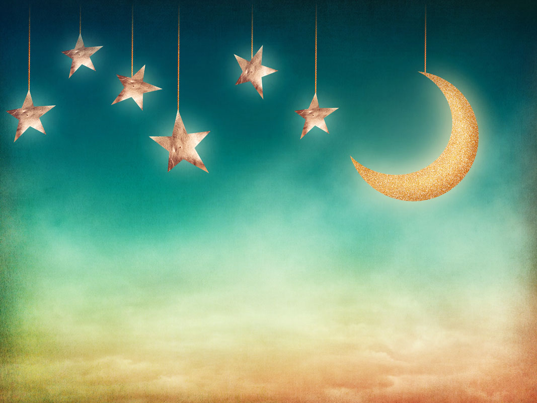
I love the moon, clouds, and the owl. The image is a little dark but it can be brightened.

The window with the moon outside is what attracts me to this. I do like the figure but she seems to paranormal romance/urban fantasy for my cover. She could be replaced with something else. Or just the concept of this could be used.

The more I look at this image, the more I'm drawn to it. It has an ethereal look to it. I would change the 'earth' to a moon as not all stories in the collection are set on Earth. While this image could have been put with the last post, it was on reviewing the folder again, that I considered it again. While the woman is young, I don't think it denotes YA.

It's the concept of sitting on a cloud more than the image itself that appeals in this case.

The stairs with a night sky in the background attracts me to this image.

Instead of Heaven, this could have 'dreams' on the sign. But really it's the background, the door concept, and the colours that stand out for me with this one. Not sure about the train track - perhaps stairs/ladder instead?

I love the swing concept (as you saw in the last post), as well as clouds and stars. Long, flowing material may look good here. While I do like this image, I think the ones from last post were probably better suited for this short story collection.

While the background is lovely, it's the concept of the signpost I like here. It can be added to another background with text added to the signs - 'wizards' 'dragons', 'space ships', 'creatures of the night', goddesses, etc etc.

Love the clock on the chain.

I like the moon and the lanterns, not so sure about the wire connecting the two, but this can be removed.

The butterflies flying out of jar, or just the flying brightly lit butterflies would suit many backgrounds. They look spectacular.

The illustrated hot air balloon would go with many backgrounds. It can be used as a large or small element. While the image on its own would be a good cover, I think the balloon on other backgrounds would work better for this project.

While this is a lovely concept, it's the doorway I am drawn too.
Background or Element


Doesn't these two images scream 'magic'? You can either add/merge these on top of a background image (just as long it's not a crowded one), or you can make it so it becomes the background image itself. So much choice!
Round up
Being able to use images for backgrounds or elements is an option if you can't find a comprehensive scene you like. By combining more than one image, you create something totally unique that no-one else has.
Some images would need more work than others to manipulate. You need to ask if it's worth the time and effort.
Again, there may be some images you are just not sure about. It's the mock up stage that allows you to truly analyse if they would suit.
Again, there may be some images you are just not sure about. It's the mock up stage that allows you to truly analyse if they would suit.
By analysing the images, a firmer idea of the book cover would start to formulate. You may even do more image searching for the different elements. I could look at more hot air balloons, or moon/clouds, or sleeping women (dream concept), doorway, stairs, or time.
Next time... Mock ups including using commercial fonts
~HelzKat~
~~~~

HelzKat Designs (Helen Katsinis) specialises in designing for writers at affordable prices.
She delivers the right look for each project from book covers, banners, business cards, to setting up and customising blogs and websites. She has also given talks to authors on the subject of blogging and navigating in the online world.
She began by designing author banners for her writing persona (Eleni Konstantine) and her writing groups. After winning the 2010 Little Gems Cover Contest (Topaz), she started to specialise in designing for other writers thus combining her two worlds of design and writing.
In 2018, she's entered the world of pre-made covers. You can see available covers HERE.
Get 50% off any pre-made cover until 30th April 2019 by using the code: DSDUblog.


